What is Color Psychology?
Color psychology is basically a method of attracting attention with the help of beautiful colors and its combinations. Choosing the right color scheme is important for your website. In marketing, color psychology plays a vital role in attracting the customers, helping them form a perception about your offerings, and positively influence their buying decision.
Every color has a different part to play. It acts as an additional contributing element in forming the perception about the product in the minds of the buyers or target audience.
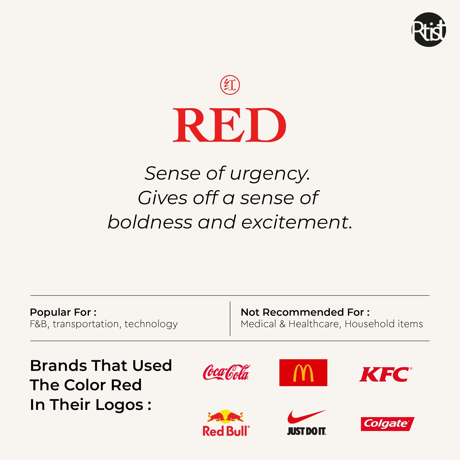
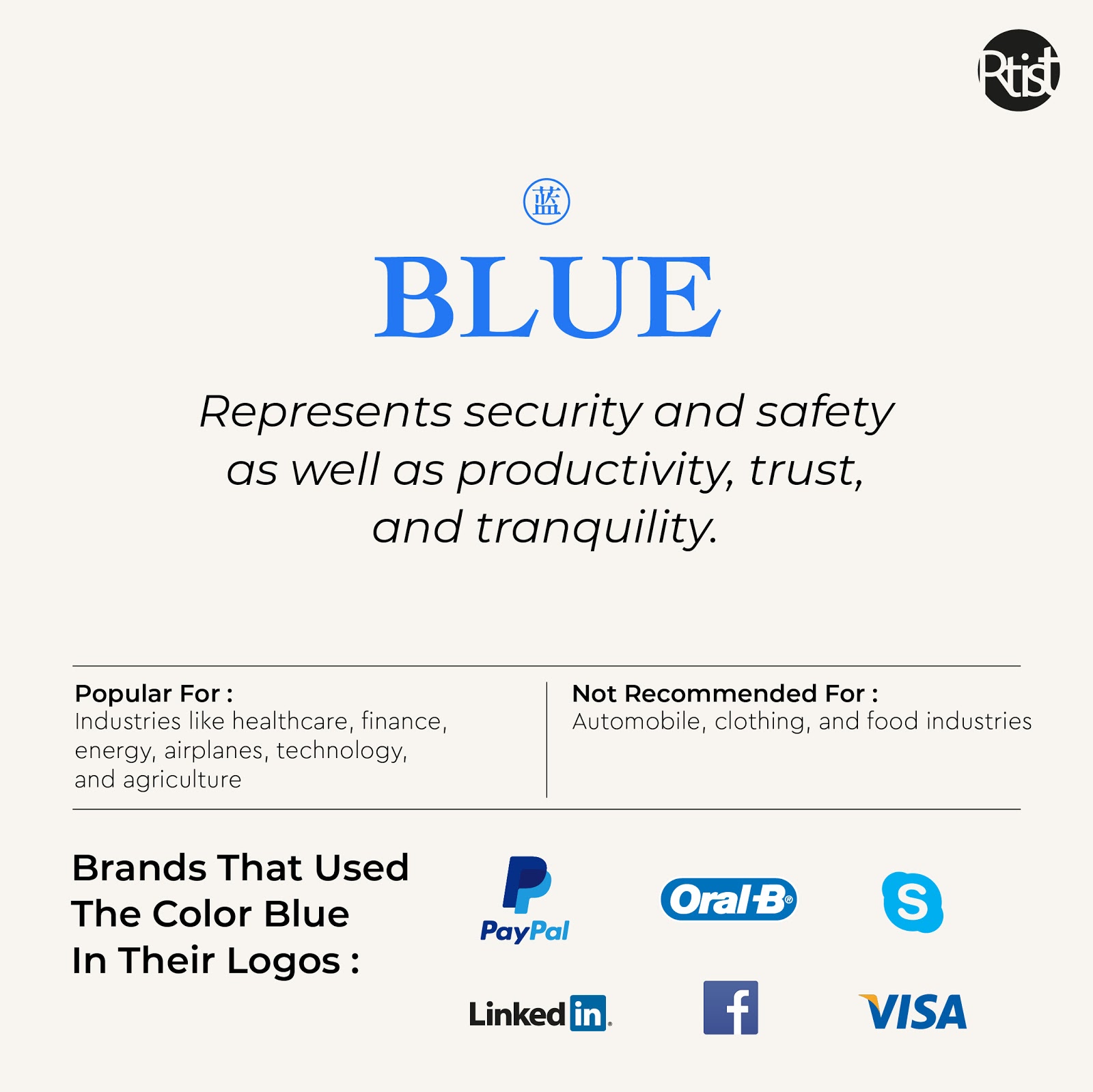
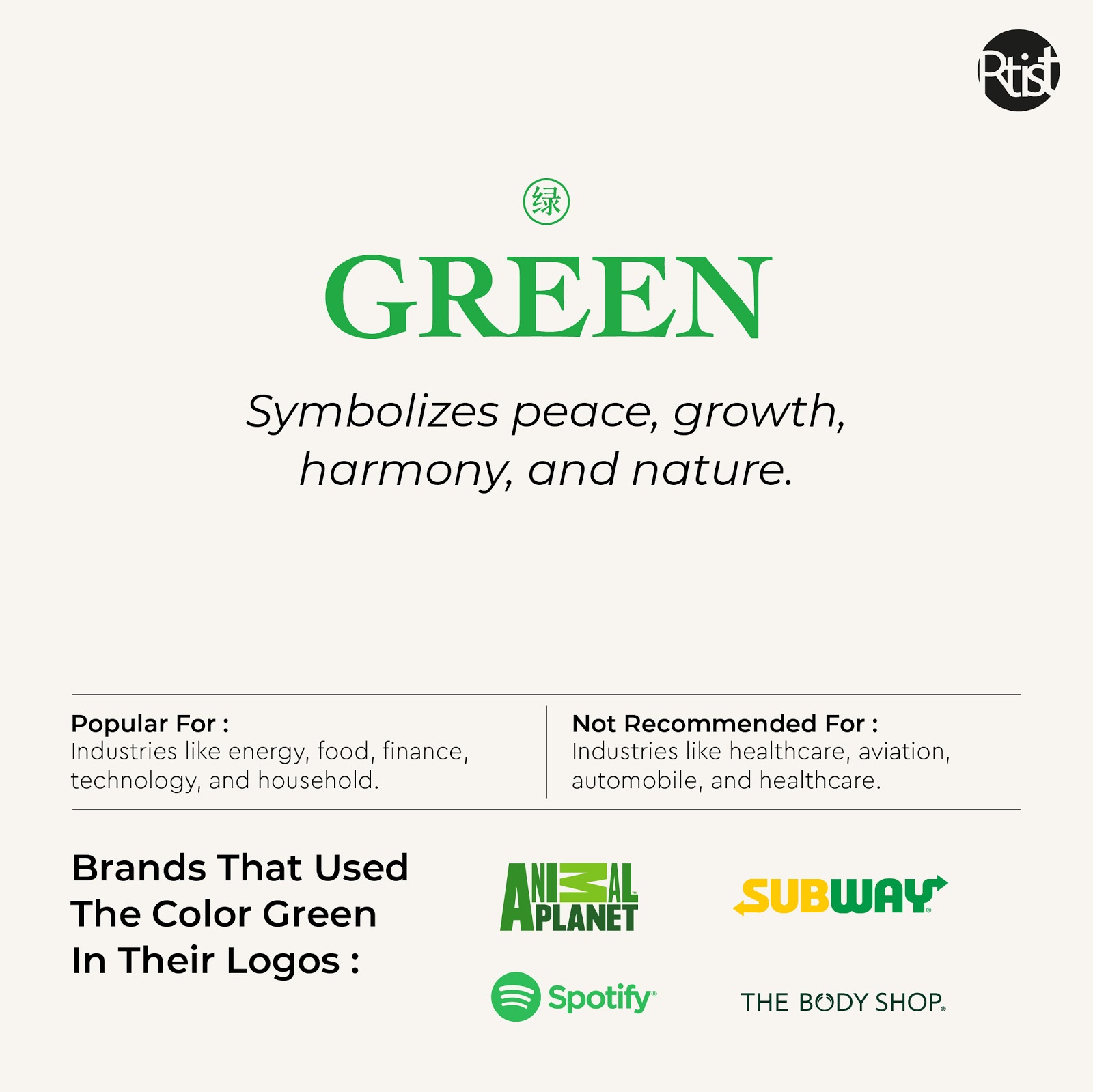
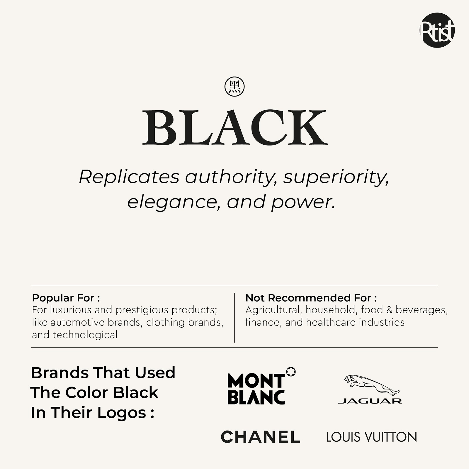
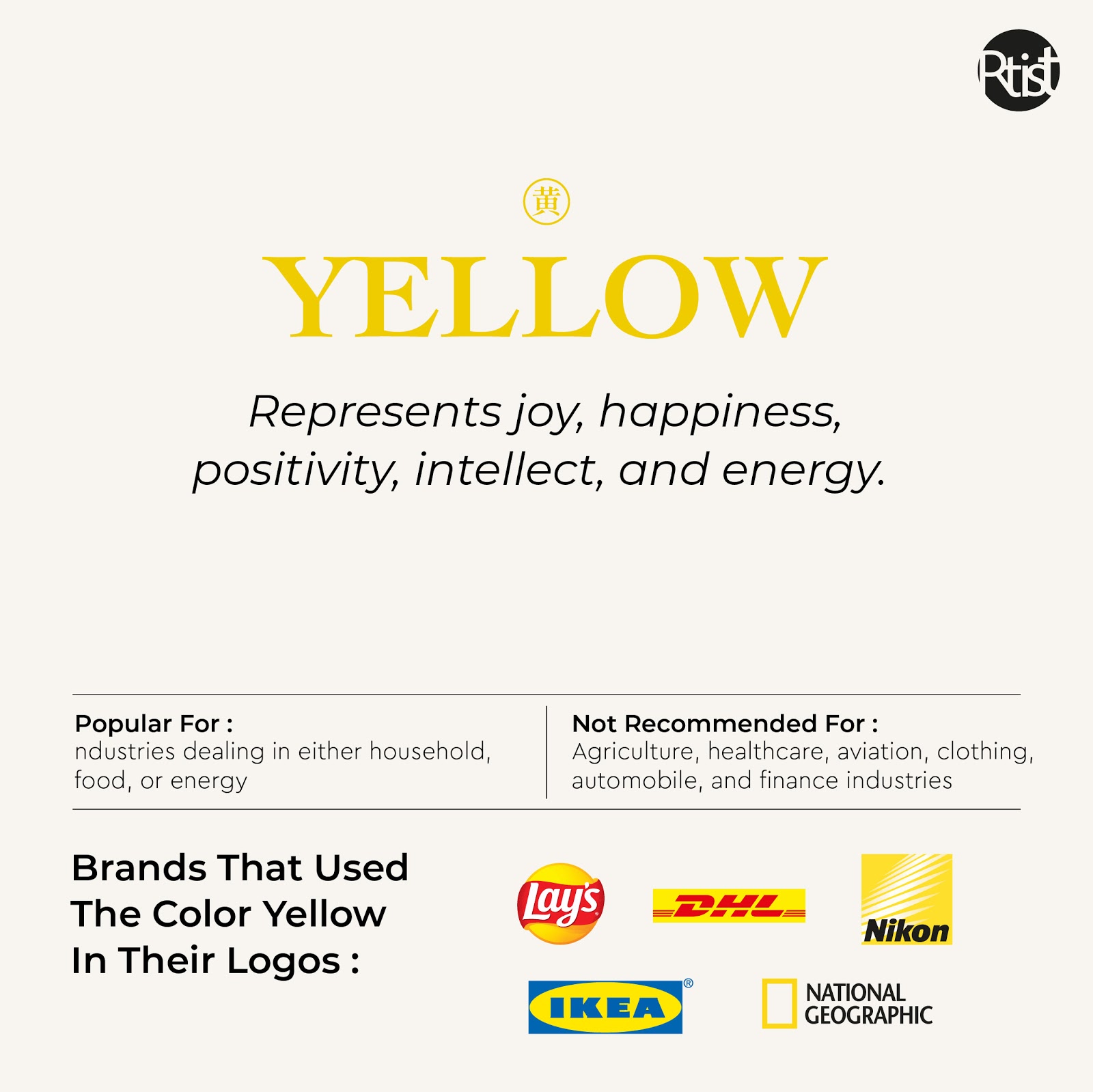
Here are some colors and the kind of messages that they communicate.
Best Tips To Decide Colors Schemes For Your Website
1. Colors can affect emotions
It is highly advisable to understand the color schemes of your website along with their impact on the probable customer base. This proves beneficial in order to maximize the effect of color psychology on your ultimate conversions.
2. Men and women have different preferences and impact of color psychology
It is essential for you to note that if you have a brand that focuses mainly on women, then you must use feminine colors like pink and red in order to maximize the chances of final sales. While on the other hand if you are dealing with a brand that focuses on the male section of the society, colors like blue and black are perceived to be ideal.
3. Understand the demographics of your target audience
Before selecting a color or a combination of it for your website, it is crucial to understand the demographics of your target audience. It would be beneficial if you are already aware of the color choices and preferences of your target audience.
4. Understand your brand and its purpose
If you are planning to add a color combination theme, then you must thoroughly understand your brand and its purpose first. It is essential because not all colors suit every brand, industry, or company. You must focus on selecting a color combination that helps you to convey the brand message effortlessly.
5. Don’t just put any color anywhere on your website
You must follow a uniformity because it helps your website look visually aesthetic and appealing to your target audience. Also, make sure to highlight your CTAs in dark or bold colors so that they stand out from the rest of the content and can speak up for themselves.
Conclusion
Color psychology is a lot beyond that just setting your creative mind free. In fact, it is more about attracting the attention of your target audience by setting up a color theme that they prefer, and that helps them form a positive perception of the brand. The power of color psychology is leveraged by the web designers and the UI/UX designers strategically, in order to improve the conversion rate and to increase the ultimate revenue.
